Just happened to stumble across National Public Radio (NPR) music early this morning and initially thought it was a redesign of npr’s webite.
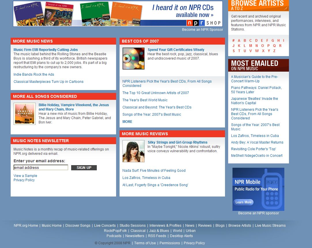
It really is visually stunning … a truly great looking site. [Click on images to enlarge]
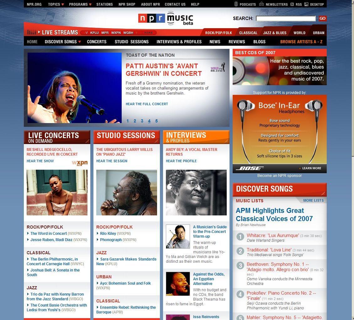
However there are a few problems that I’ve noticed with the homepage design
- Busy navigation: there too many navigational elements at the top of the page … (almost four different blocks of navigation) which could easily confuse users,
- Flow: After the main flash box, it is not immediately apparent what next to click on. Each of the elements after that (even in the right column and below it) compete equally for attention
- Busy: My worry with the design is that they seemed to have crammed almost EVERYTHING about the site in on the home page. This is either a sign of design-by-committee or a designer who didn’t make the tough decisions necessary to make a lovely site into a FANTASTIC site. Remember “good is the enemy of great”
Lest you get the impression that we hate the site, that is not correct, their use of color is amazing. Blocks of information are separated out and highlighted so that there is no doubt what each block is about.
We just wish they wouldn’t have left all the decision making to the user.
[Go to npr music]